The Chicago Graphic Design Club posted a project to create a poster illustrating what Chicago means to you. The brief was this: Write a statement about what Chicago means to you and interpret it by designing a11x17in poster using the Big Shoulders typeface (available through Google Fonts).
Even though I was not born in Chicago, I have lived here for 25+ years and consider myself a native. The city is in my blood, and now that I am here, I don’t think I will ever leave. This project made me think why this is. The last few years (adding in current matters with the teachers strike) has made Chicago a really difficult place to live. The city keeps taking and taking - yet we don’t leave. Its residents love this city. So we shoulder all the BS and just keep preserving.
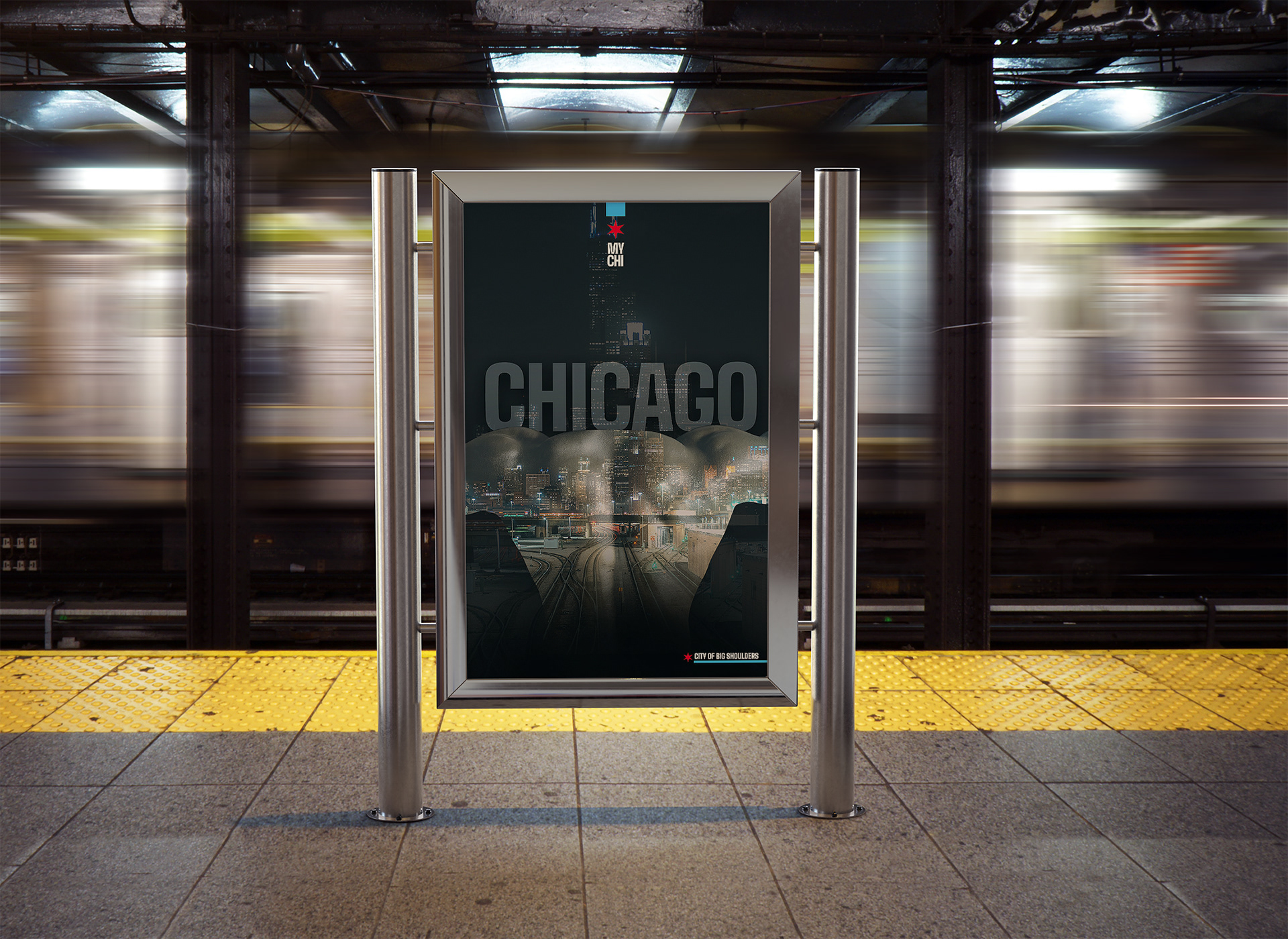
I wanted to illustrate the strength of the city’s people. Using the nickname “City of Big Shoulders” is what I wanted to portray. I found the perfect images on Pexels.com, a muscular back and the photo of the city from the “back side”, the working side; not the pretty Lake Shore Drive angle for tourists. I took these images and set to work.
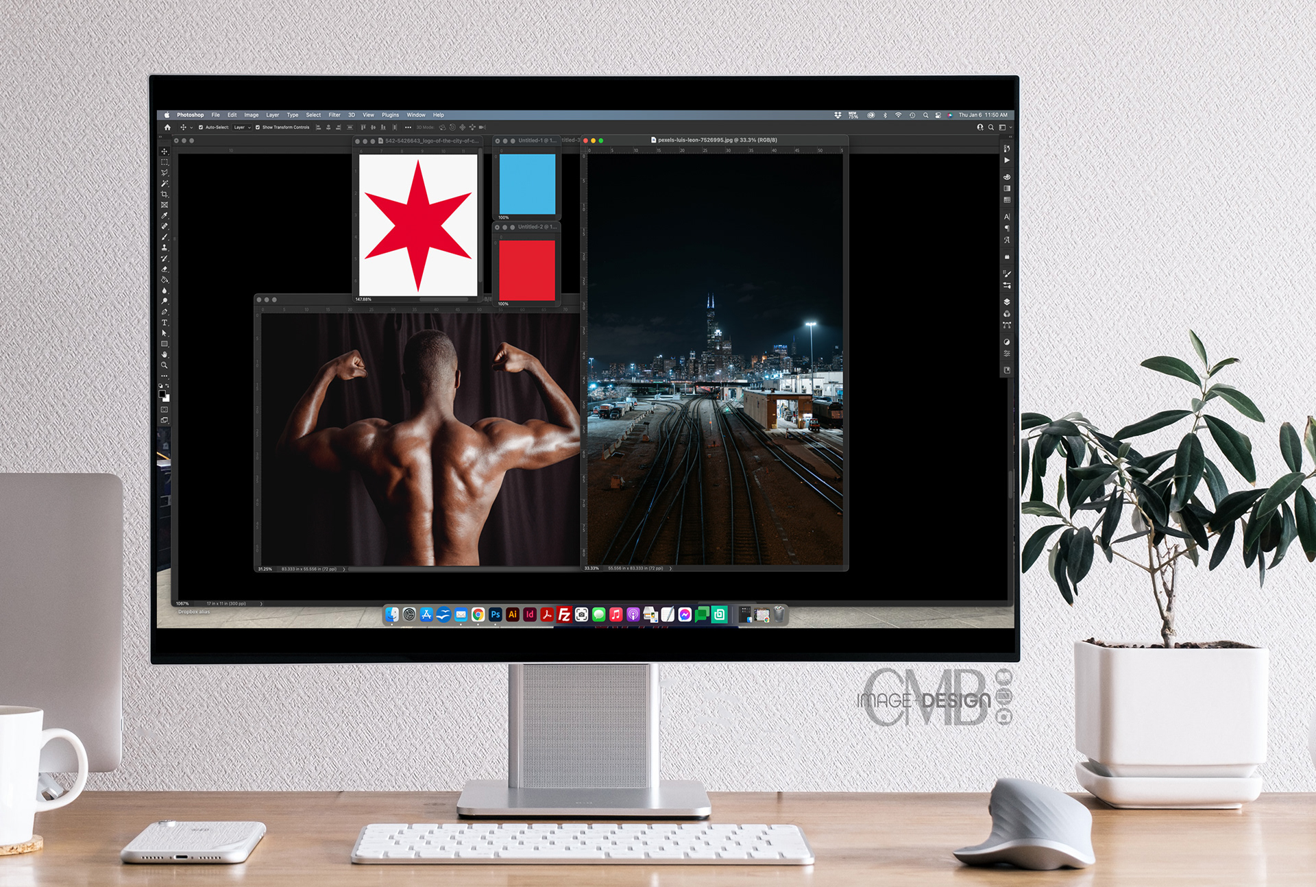
This is what I created.
The statement I submitted with the poster design was this: “Chicago boasts the nickname "The City of Big Shoulders". Living in Chicago is difficult. Its residents are burdened with exorbitant taxes, merciless crime, and government indifference (to name a few); and yet we do not give up on this city. We bear every burden weighted upon us on strong shoulders and carry on. The people are what make this city strong.” ~ Cheryl Bever
Thank you Chicago Graphic Design Club. It really means a lot that my poster design made the cut with all the other awesome submissions which you can see here >
Thanks for checking out my work and reading along!
Designed by CMB Image + Design
© All rights reserved.