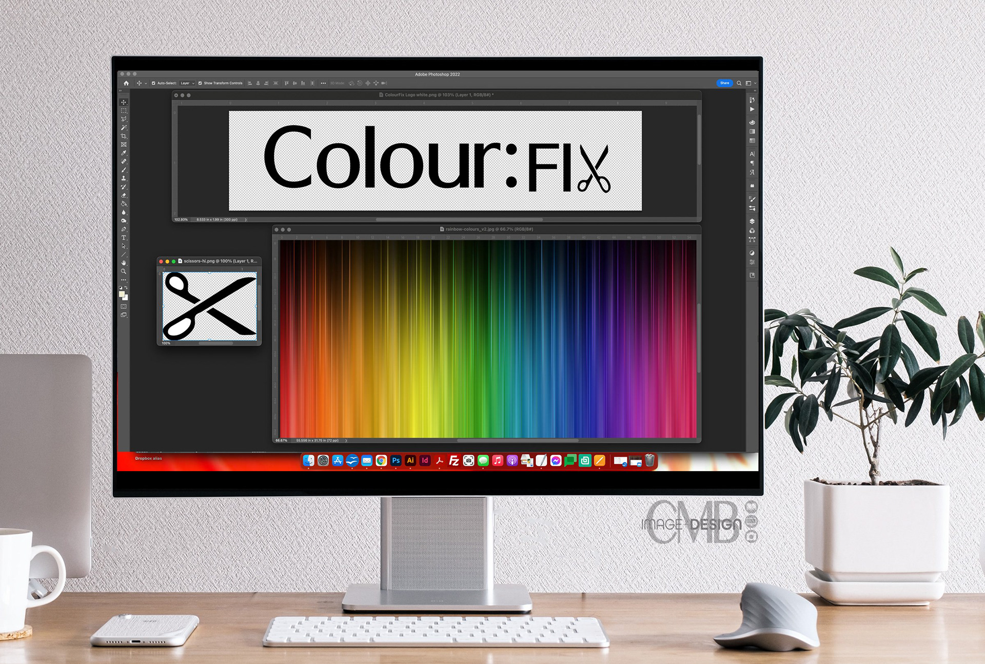
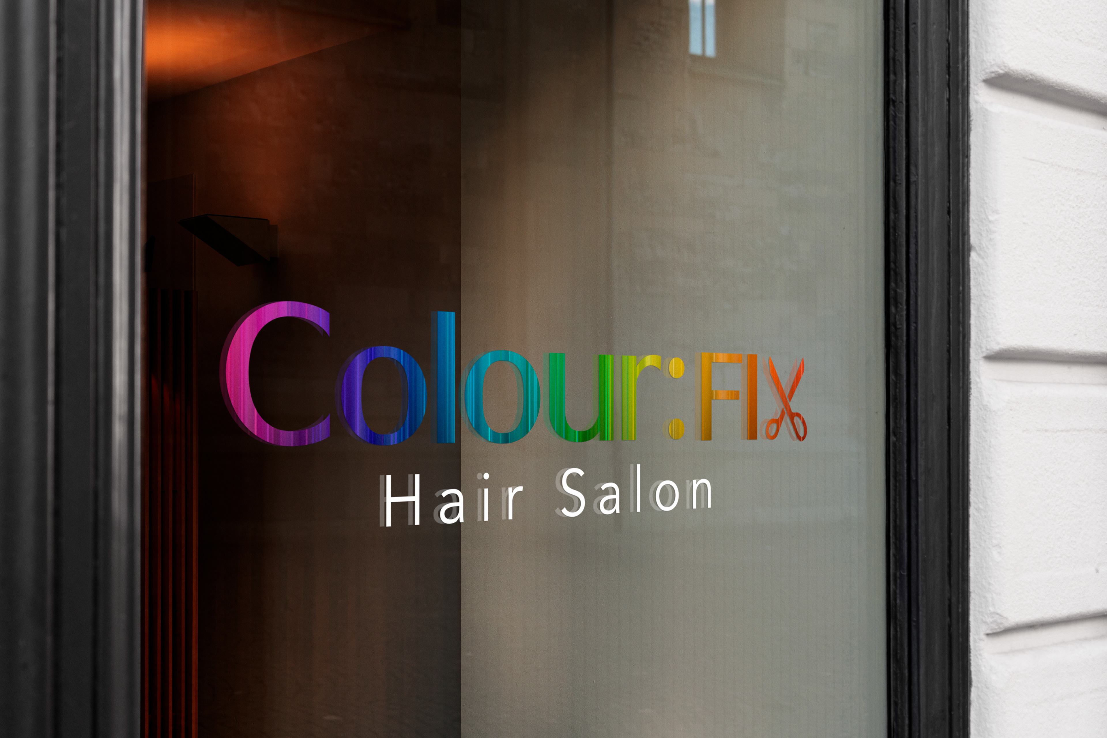
There are so many different ways you can show off your logo. As a window decal, a business card, stickers, and/or any type of promo item. The list goes on and on! So it is important that it perfectly represents your brand. Here is a logo I designed for private Chicago hair color studio, Colour:fix salon and the thought process behind it.
Colour:fix is a hair salon for those that are addicted to color, any color. They specialize not only in vivid colors, but go in there wanting some life breathed into your brunette or blonde and you will not be disappointed! "If colour is your addiction, then we are your fix."

The color artist behind colour:fix is a no nonsense individual. No frills, no gimmicks. Their mission is simple, to give you the best colour and cut that you have ever had! So their logo had to embrace that no nonsense simplicity, yet get the point across of what they do.
I found a clean simple font, and filled it with this great gradient of color that has a linear pattern that, in my mind, looks like hair. To add a fun, element to the word, I used a pair of scissors in place of the X in fix.

Love to hear what you think about this design. Tell me in the comments below 👇.
Thanks for checking out my work and reading along!
Designed by CMB Image + Design
© All rights reserved.