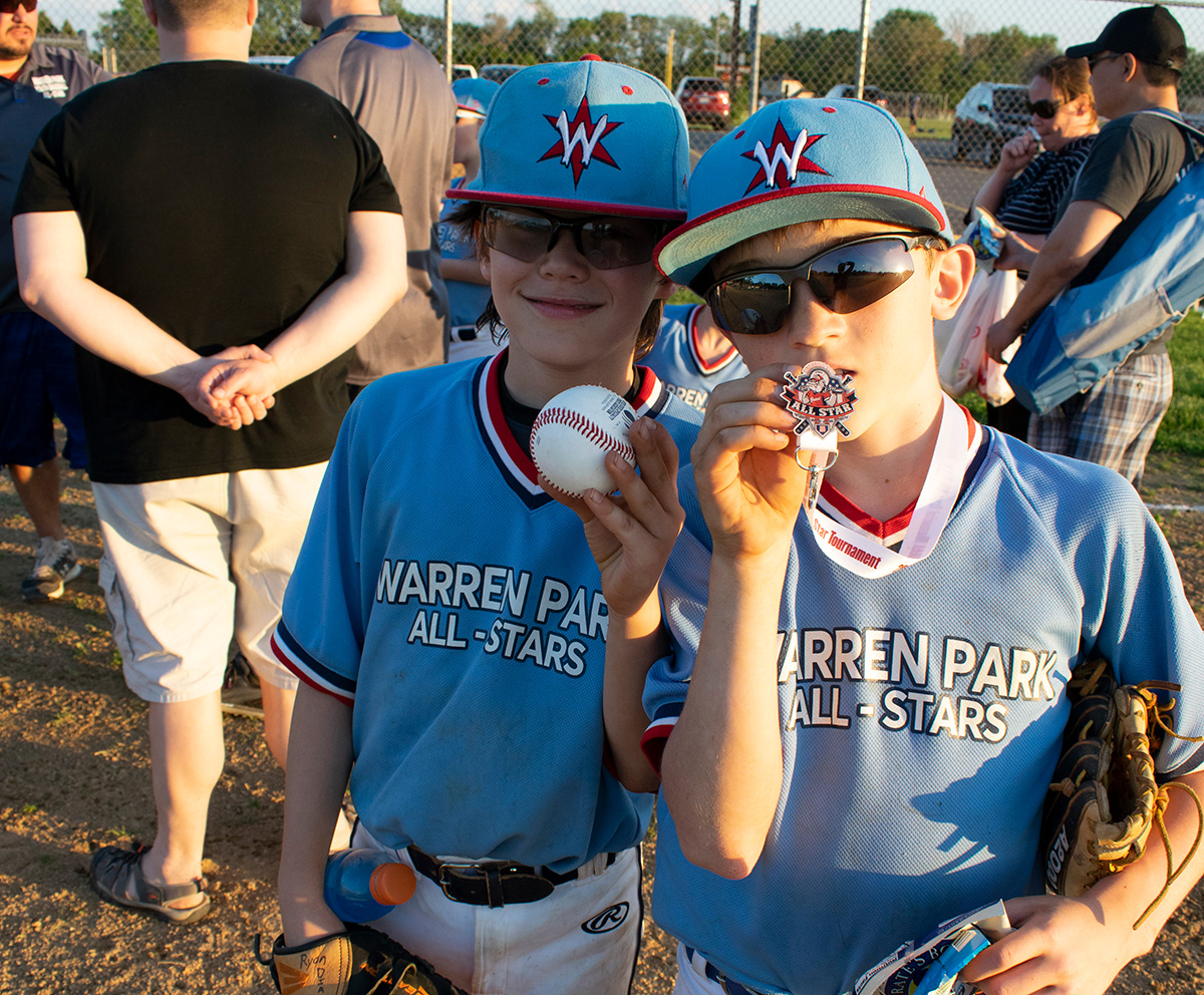
This project was special to me. It is a graphic I created for my son’s baseball team. This was a great group of kids and a great travel baseball program. When we received their uniforms, I was a little underwhelmed with the design. It was a straight text of the words Warren Park All Stars in a simple font. Now their hats, on the other hand, were sooooo cool! Why couldn’t the main logo mimic that?
Well, being the typical crazy baseball mom - and having a knack at graphic design, I wanted to create something that the kids could be proud of when they took to the field. Like I said, I loved the emblem on the hat, so I wanted to expand on that. I envisioned an emblem using the Chicago Star in a fun graphic novel kind of way. These were 10 year olds, comic books and baseball are like staples to them!
So here are a few ideas I came up with…
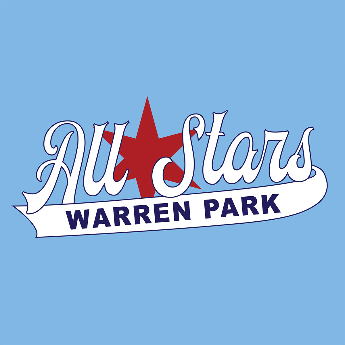
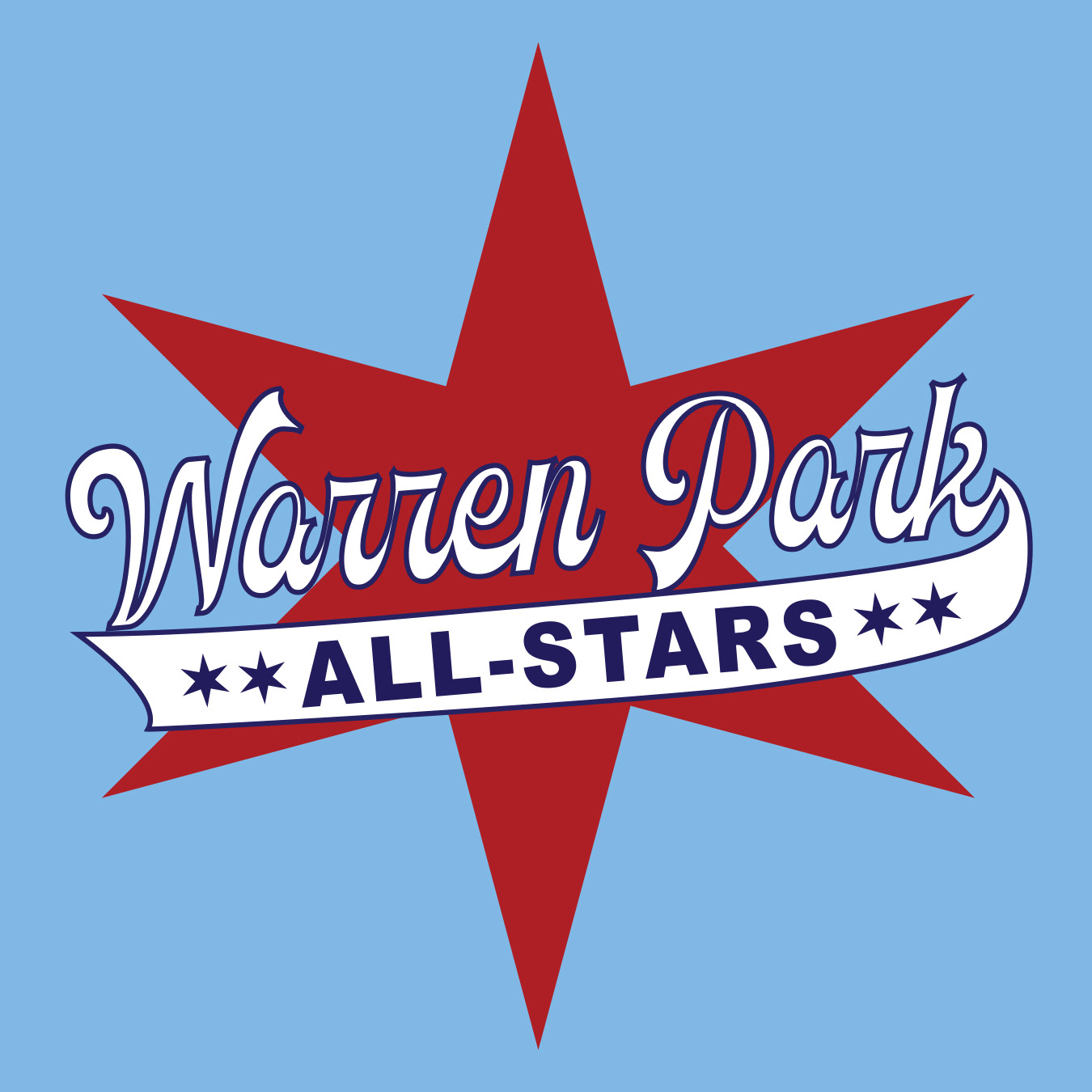
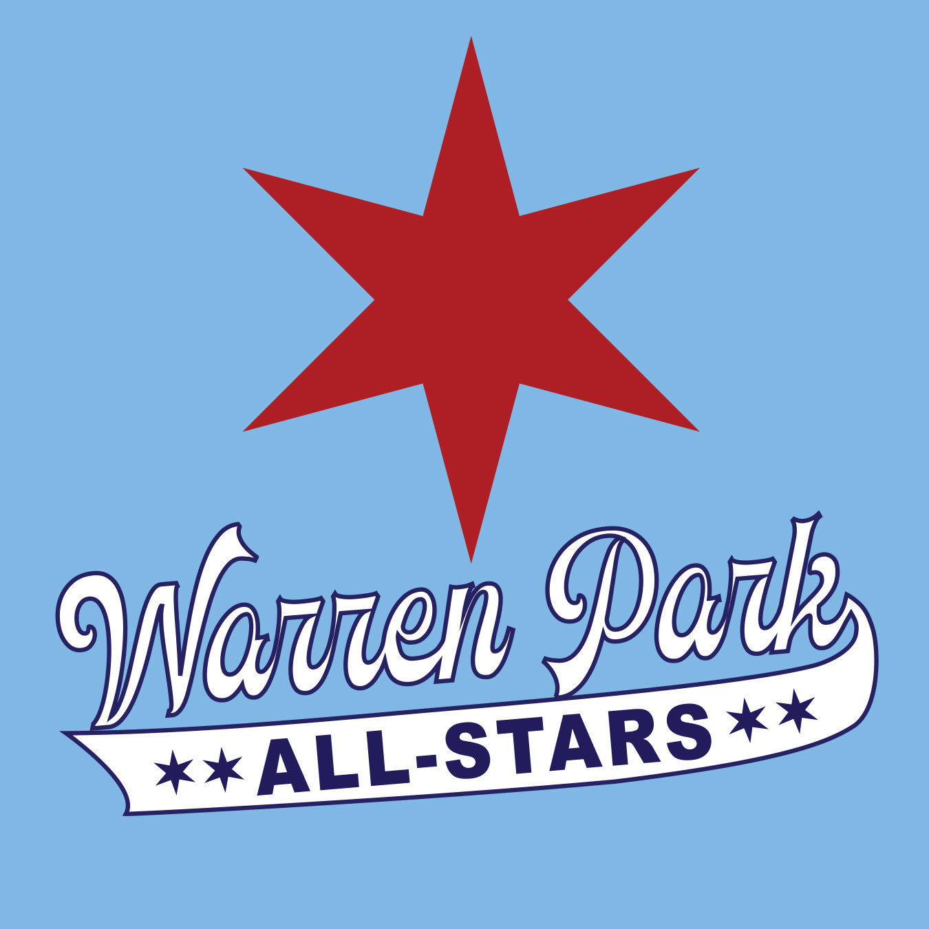
Kinda cool, right?
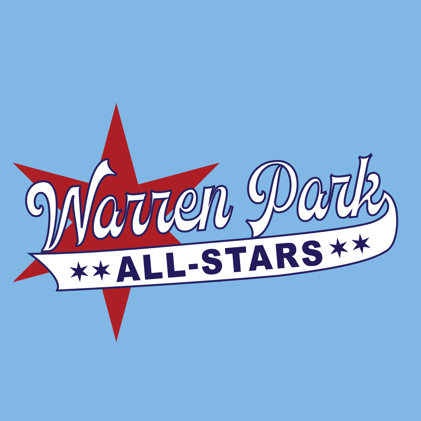
Well the team already had uniforms, so we had to figure something else out for the logo. If you aren’t familiar, baseball in Chicago is a mess when it comes to weather. We have had entire seasons ruined by rain, lightning, sweltering heat, frigid temps and even snow! So the team parents decided to go in on sweatshirts for the team with the new logo.
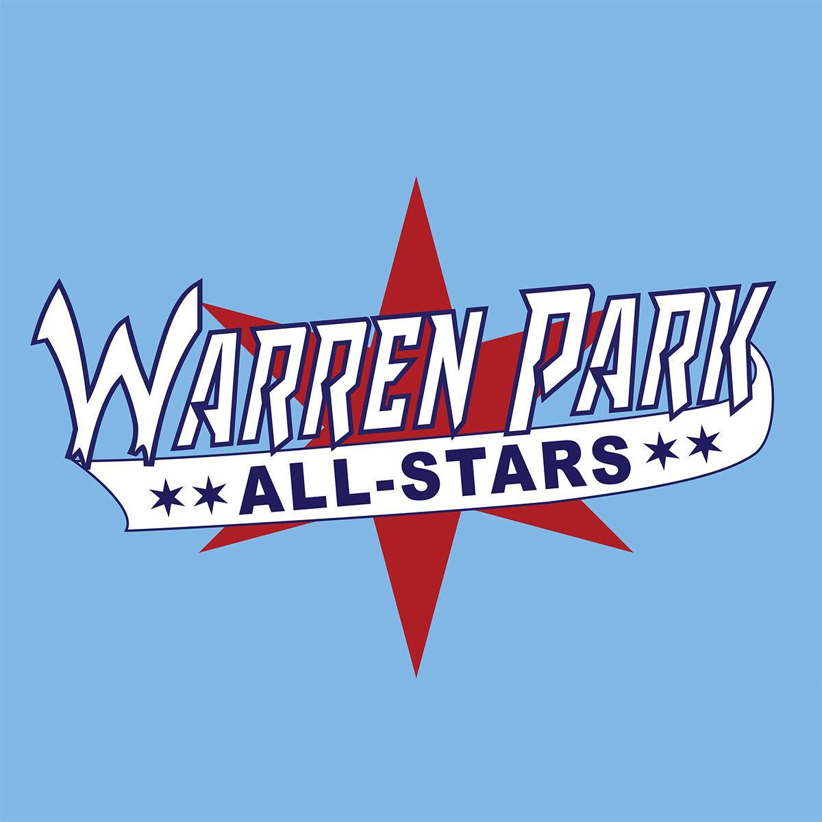
Oh right! Want to see the one we picked?
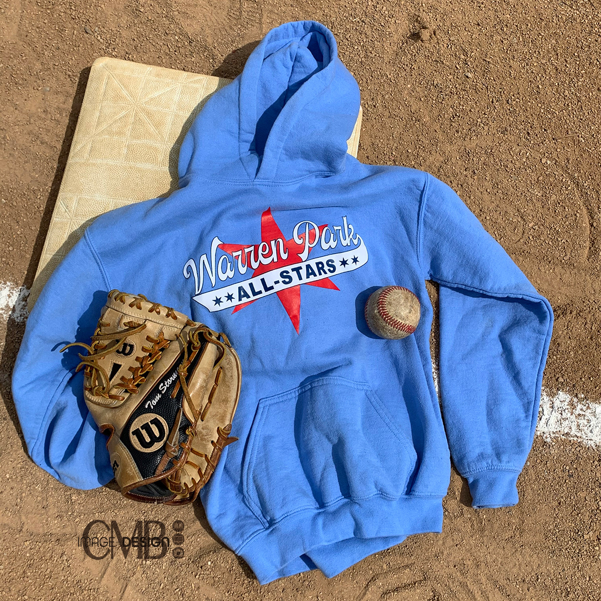
Warren Park All Stars Emblem by CMB Image + Design
Here it is! The final designs. This was created a few years ago, but parents still come up to me to say that this is still their son’s favorite sweatshirt. That is why I do what I do. To create a feeling of pride in the recipient of my work.
Thanks for checking out my work and reading along!
Designed by CMB Image + Design
© All rights reserved.