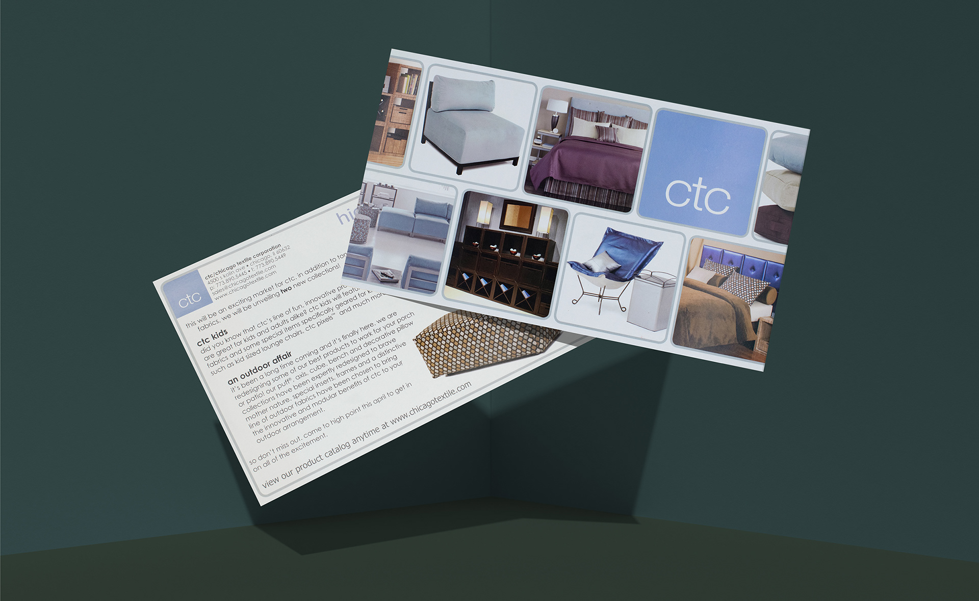
When you have a business that has a lot to offer, it can be difficult to include it all into a single handout without your message getting lost in all of the noise. Chicago Textile Corporation (CTC) was a furniture and home decor manufacturer based in Chicago, IL. They created pillows, seating, bedding, shelving, all kinds of home furnishings. But what made their offering special was the modern, modular designs built apartment sized to fit any space.
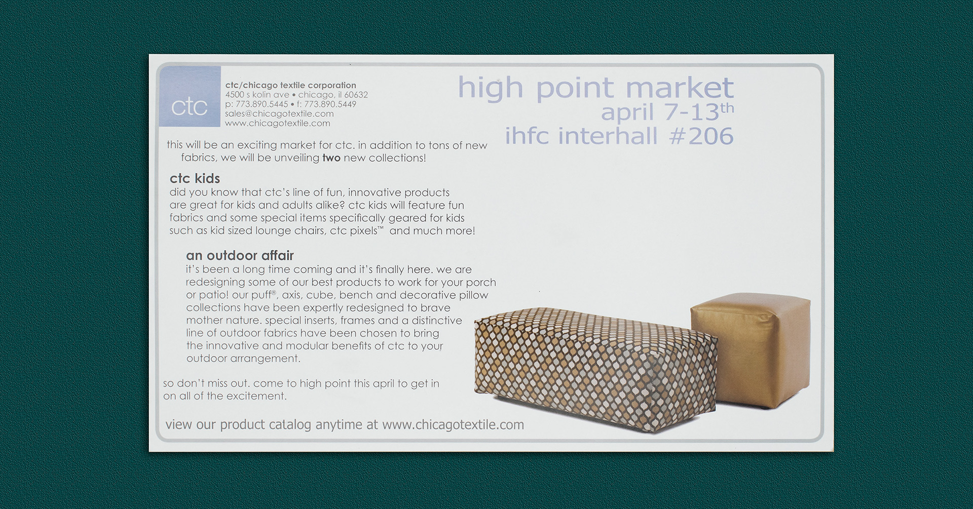
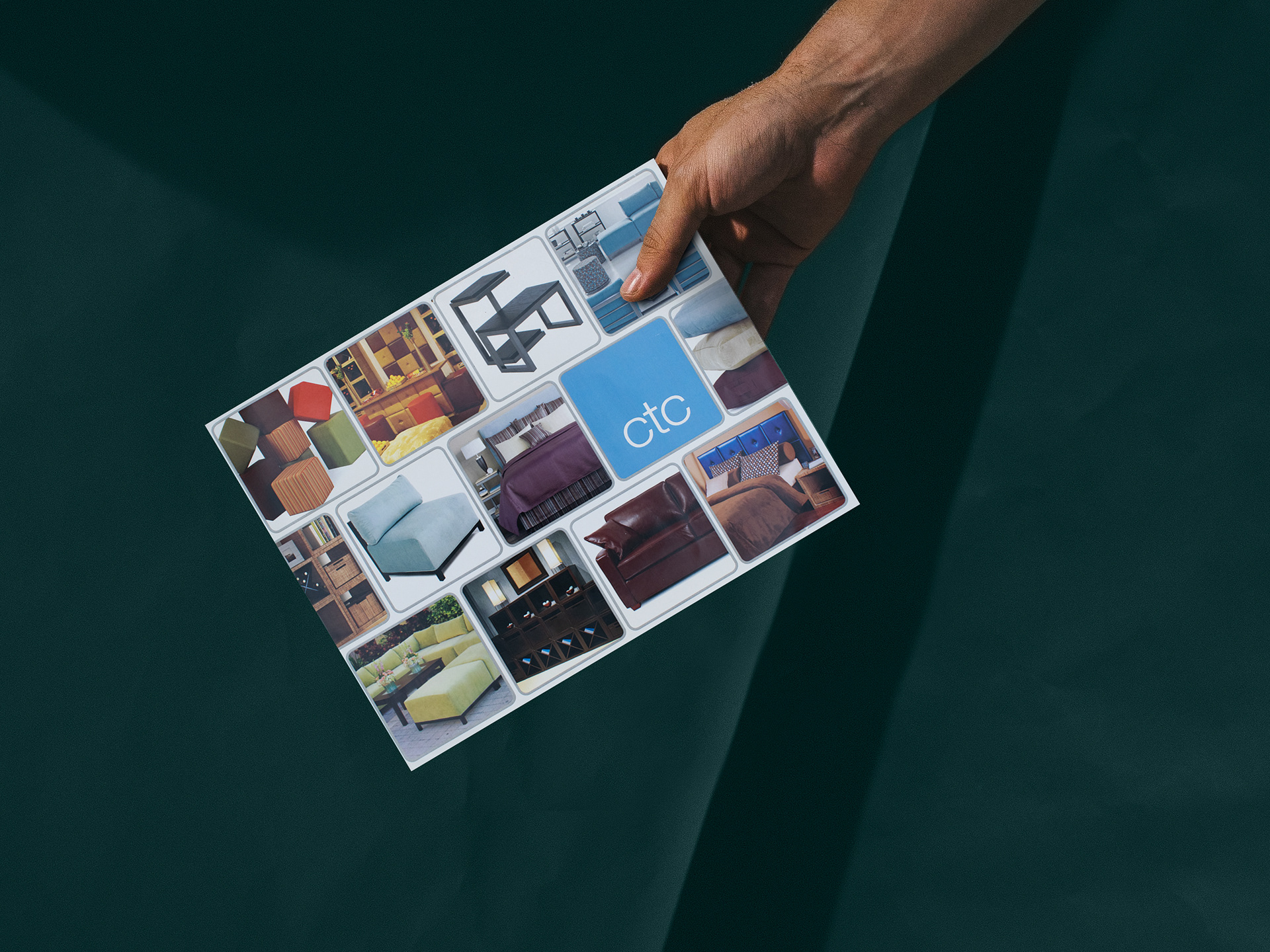
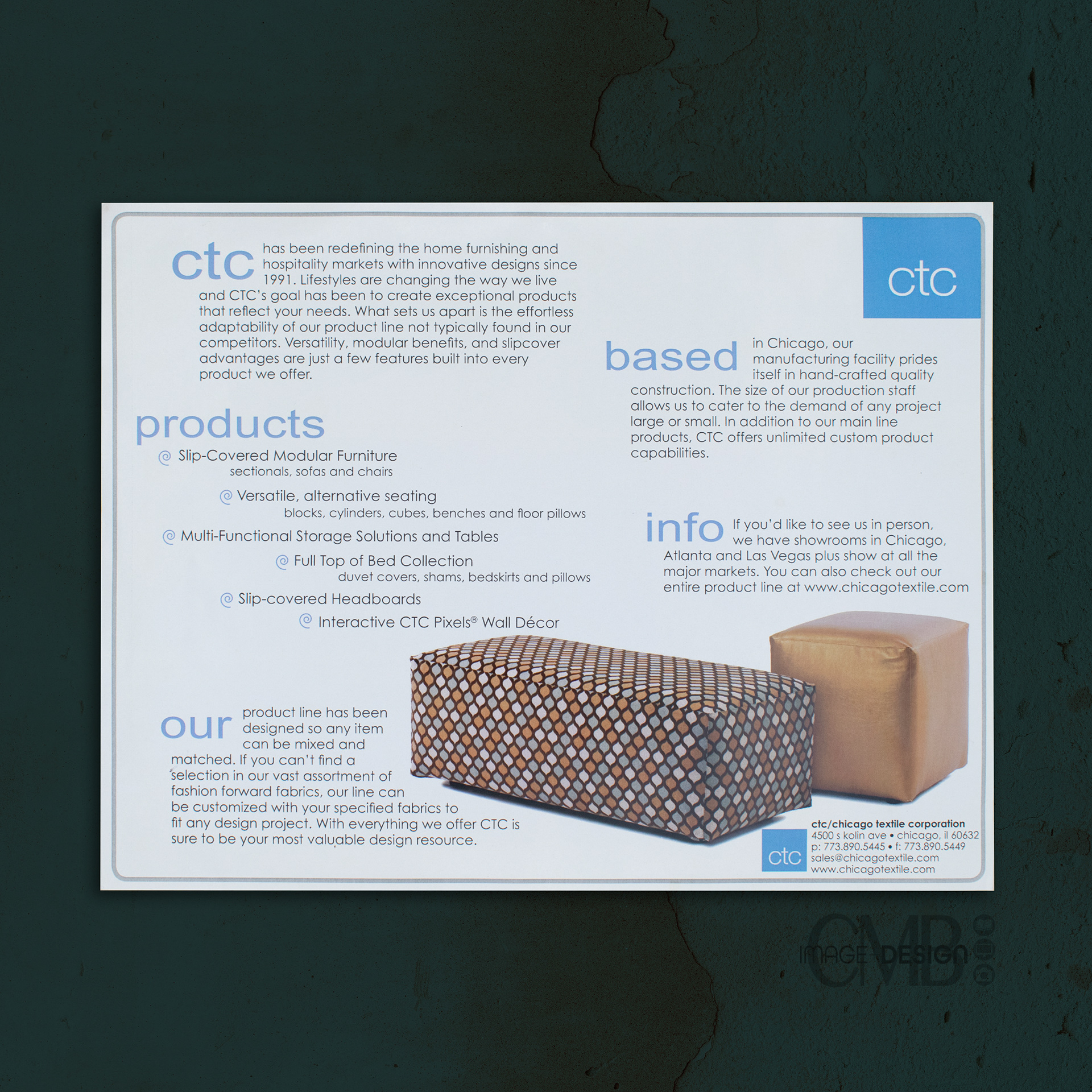
CTC needed handouts and mailers for an upcoming trade show. We wanted to create something that stood out in all the noise and visually displayed the vast offering of the company. To show the variety of product and their unique style without being too busy, I used this film strip design. It shows how each item can work on its own and in harmony together. While the back of the card gives info of a new collection and the dates of the upcoming show.
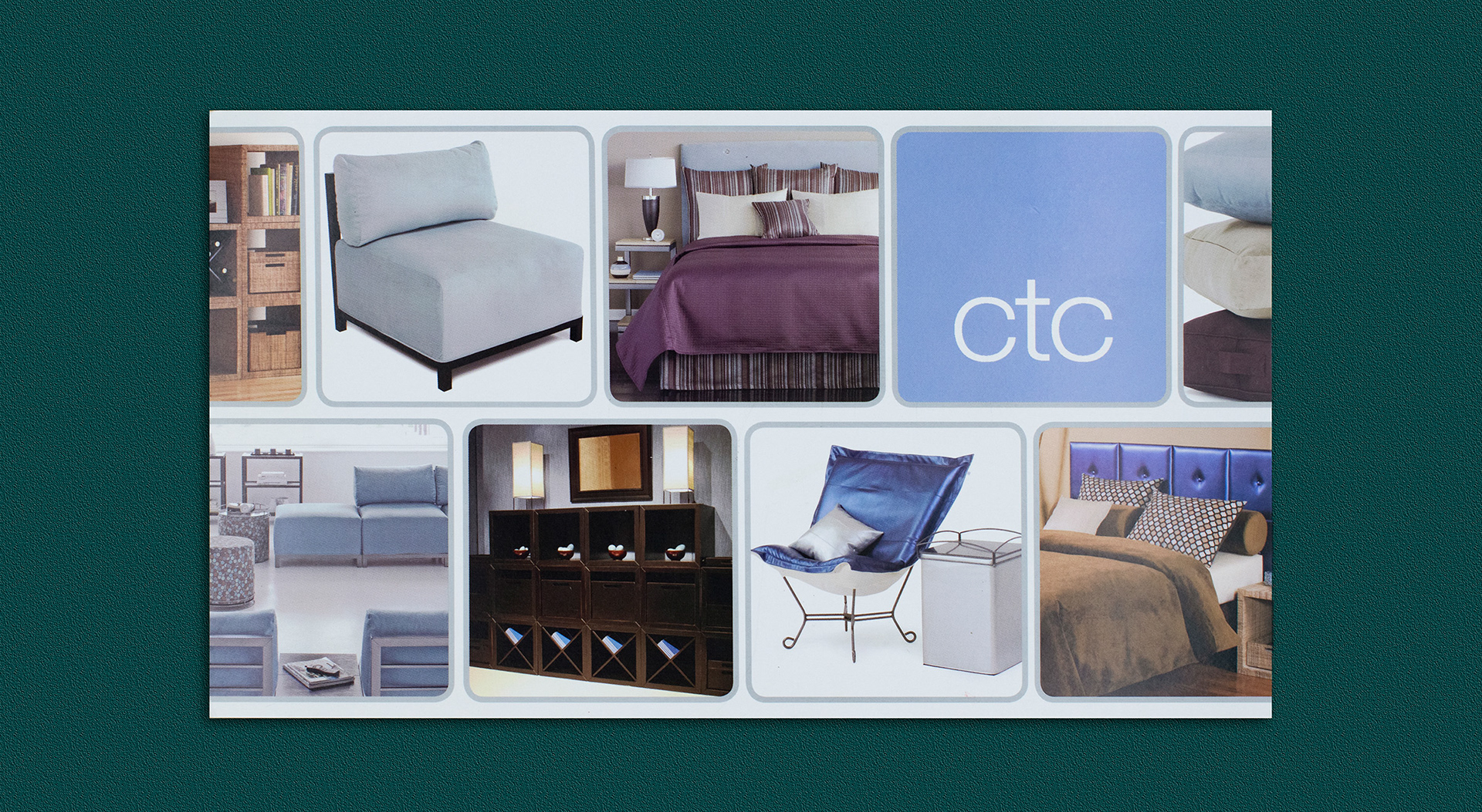
The design was a hit! We began testing it out on other formats. The grid design of the image cells allowed you to add, arrange and format to the space needed. Below is a flyer we created in a letter size to hand out as an “about us” for the company. As you can see, we added a row of cells allowing us to show more of the product offering. The mix of lifestyle and silo images created the perfect balance and lets your eyes flow through the imagery.
The larger format of the piece gave us more room to tell the story of CTC.
With all of these new handouts and company information, we needed a place to put them and distribute as a packet. Never underestimate the power of a two pocket presentation folder! The two pocket design made it the perfect vessel for press kits at trade shows, housing multiple handouts for customers, and as give-aways and mailings with company info inside. The left pocket had a cut out to house a company business card.
The film strip design style worked perfectly for this application as well! I added a few more rows and made them longer to cover the piece from end to end. This allowed us to show more product in a harmonious way! I think this folder design really made the company stand out and it grabbed the attention of the viewer giving them an idea of what the company did and the type of product they created. It enticed the holder to want to open the folder and find out more.
The film strip design style worked perfectly for this application as well! I added a few more rows and made them longer to cover the piece from end to end. This allowed us to show more product in a harmonious way! I think this folder design really made the company stand out and it grabbed the attention of the viewer giving them an idea of what the company did and the type of product they created. It enticed the holder to want to open the folder and find out more.
By updating the photos in the cells, we were able to use this design for additional marketing pieces including print ads, more postcards and flyers!
I’d love to hear what you think of this design. Tell me in the comments below.
Thanks for checking out my work and reading along!
Designed by CMB Image + Design
© All rights reserved.