"If colour is your addiction, then we are your fix." This is the slogan of Chicago based artist, Colour:fix Art.
Painting is something that has been a long time hobby and passion of Colour:fix founder & artist, Michael Bever. But now, it is his profession as well and he needed the basics, logo & business cards!
You might think that an artist just paints a pretty picture, but you wouldn't believe the amount of color theory, techniques and science he applies to every work. Therefore, he wanted his logo and business cards to be all about the science of Colour: Colour theory. Check out the logo designed by moi and the progression of the project here: LOGO DESIGN: Colour:fix Art.
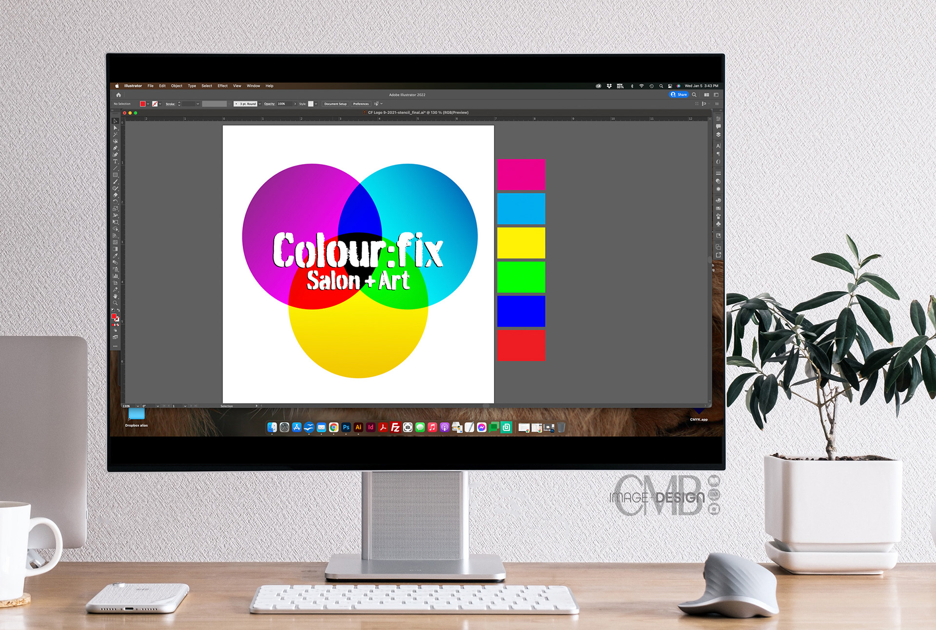
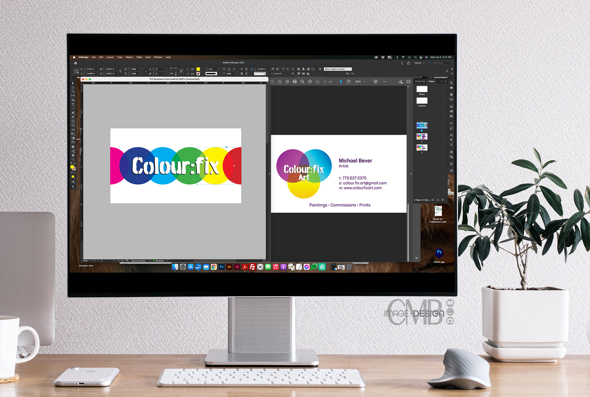
If you hopped onto the post highlighting the logo design, you’ll see the logo we designed integrates the color wheel into the logo. But I felt we needed to do something different on the business cards to grab attention and use up all of the space of the horizontal format.
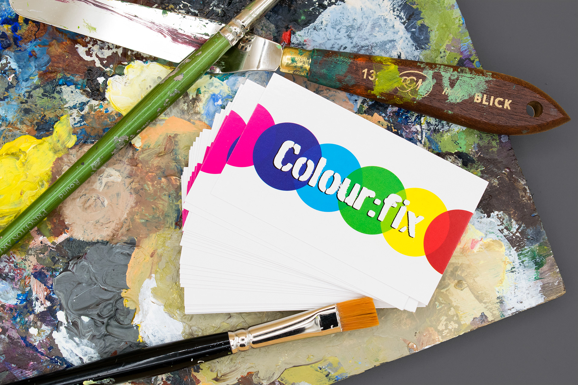
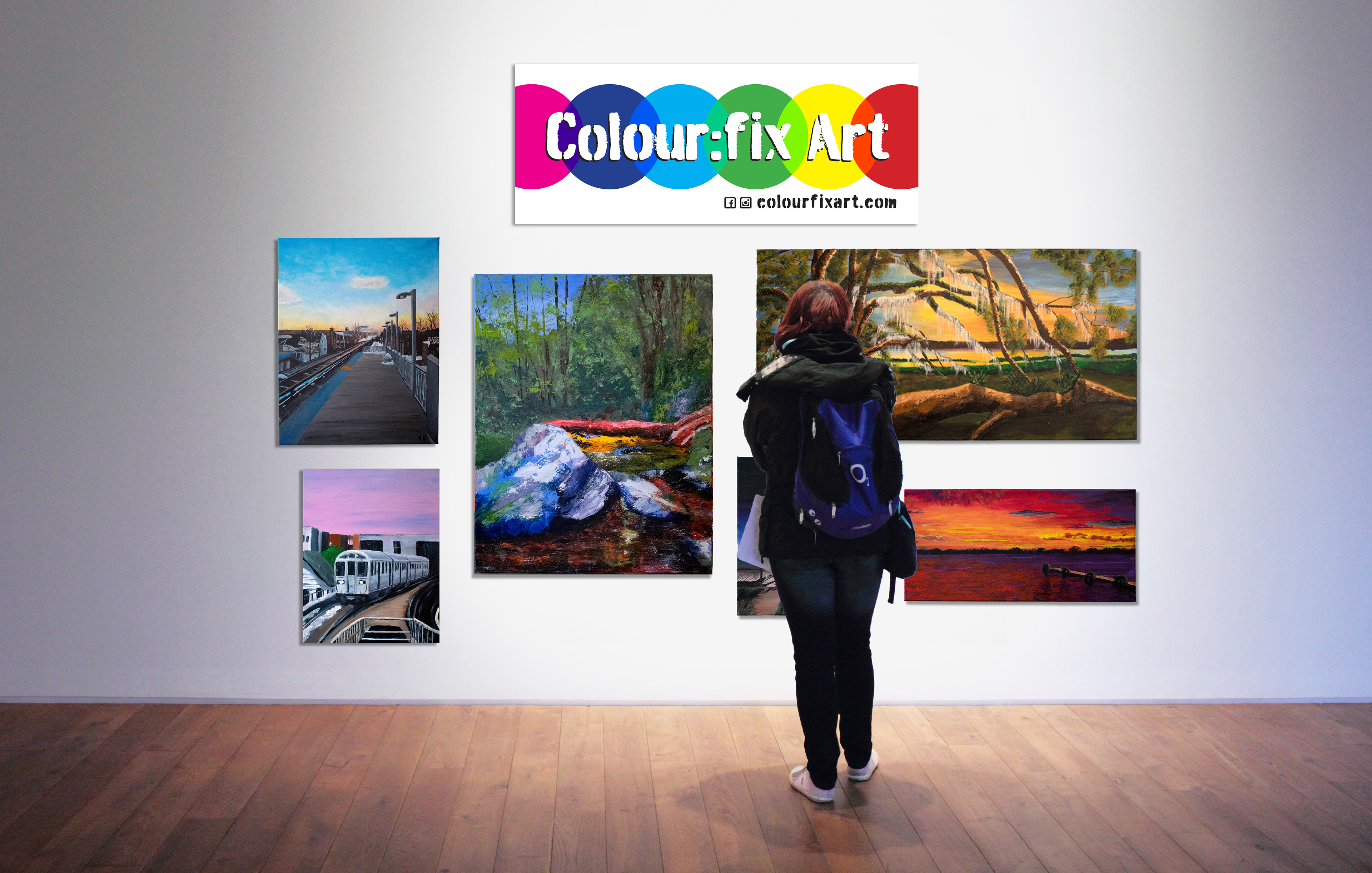
I really like how they turned out and this composition lent itself well to signage that we created for him to use at his exhibitions (next one coming up Jan 22 in Chicago! - more info on that here >).
Check out their website: www.colourfixart.com. (BTW I created that too!) Here you can get your fix of colour with all of his art both on hair and canvas!
Love to hear what you think about this design. Tell me in the comments below 👇.